Posts Tagged ‘typography’


Sevan Demirdjian

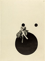
1.2.3.4. solo, duo, trio, quatuor de la danse contemporaine, 1993

8e biennale de danse du Val-de-Marne, 1995

9e biennale de danse du Val-de-Marne, 1997

10e biennale de danse du Val-de-Marne, 1999

Dalloz-Sirey, collection Aide-mémoire, projet, 1999

Masson, atlas pratique médical, 2000

Liberté, Théâtre du Beauvaisis, 2007

Lettrine hybride, Année de l'Arménie en France, 2006-2007

Théâtre du Beauvaisis, plaquette saison, 2006-07

Théâtre du Beauvaisis, plaquette saison, 2005-06

Musée d’Orsay, dépliants pédagogiques, 1986
프랑스 태생의 Sevan Demirdjian(1960 ~ )은 Higher Institute of Applied Arts(Paris)에서 공부를 마치고 잠시 freelance graphic designer로 일하다 Orsay Museum, French Museums Organization, Paris Opera, commissions for the French overseas tourist board, BNP Paribas, Dalloz publications 등을 포함하는 고객을 위해 디자인 작업을 하고 있습니다. 특히 지난 14년간 Val-de-Marne National Dance Biennial의 모든 그래픽 작업을 해왔고, 최근 5년간은 Beauvais Theatre의 visual identity작업을 해왔습니다.
Quote:
“In the beginning I was fascinated by the minimalism of the geometric forms: the seriousness of a black square on a white background or the cosmic attraction of a white dot on a black background.
Typography was reduced to its role as a source of information, as a conveyor of text. Either that or it functioned as a word-picture.
Progressively, letters began to become an element in their own right, an expression of what was essential. Reworked, redesigned, invented then reinvented, manipulated, colored then placed in context they become theatrical when used for a theatre poster, choreographed when used for dance.” (Sevan Demirdjian’s Approach to typography)
{via sevandesign}

Wolfgang Weingart

Wolfgang Weingart

Wolfgang Weingart

Wolfgang Weingart

Wolfgang Weingart

Wolfgang Weingart

Wolfgang Weingart

Wolfgang Weingart

Wolfgang Weingart
1963년 Armin Hofman의 추천으로 Basel School of Design에서 typography에 대해 학생들을 가르친 독일 태생의 Wolfgang Weingart(1941 ~ )는 Deconstruction이라는 새로운 typography 접근으로 자신을 포함한 기존의 Swiss typography로부터 벗어나 타이포그라피 역사에 있어 새로운 장(“New Wave”)을 열게 됩니다.
Quote:
“I took ‘Swiss Typography’ as my starting point, but then I blew it apart, never forcing any style upon my students. I never intended to create a ‘style’. It just happened that the students picked up — and misinterpreted — a so-called ‘Weingart style’ and spread it around.”