Posts Tagged ‘Abstract’
Blinky Palermo

Soft Speaker 1965

untitled 1974

untitled 1970

Composition with 8 Red Rectangles

Blue Disk and Staff 1968

slide

Coney Island II, 1975

title not known 1970

Composition, 1966

flipper 1970

untitled 1971
")
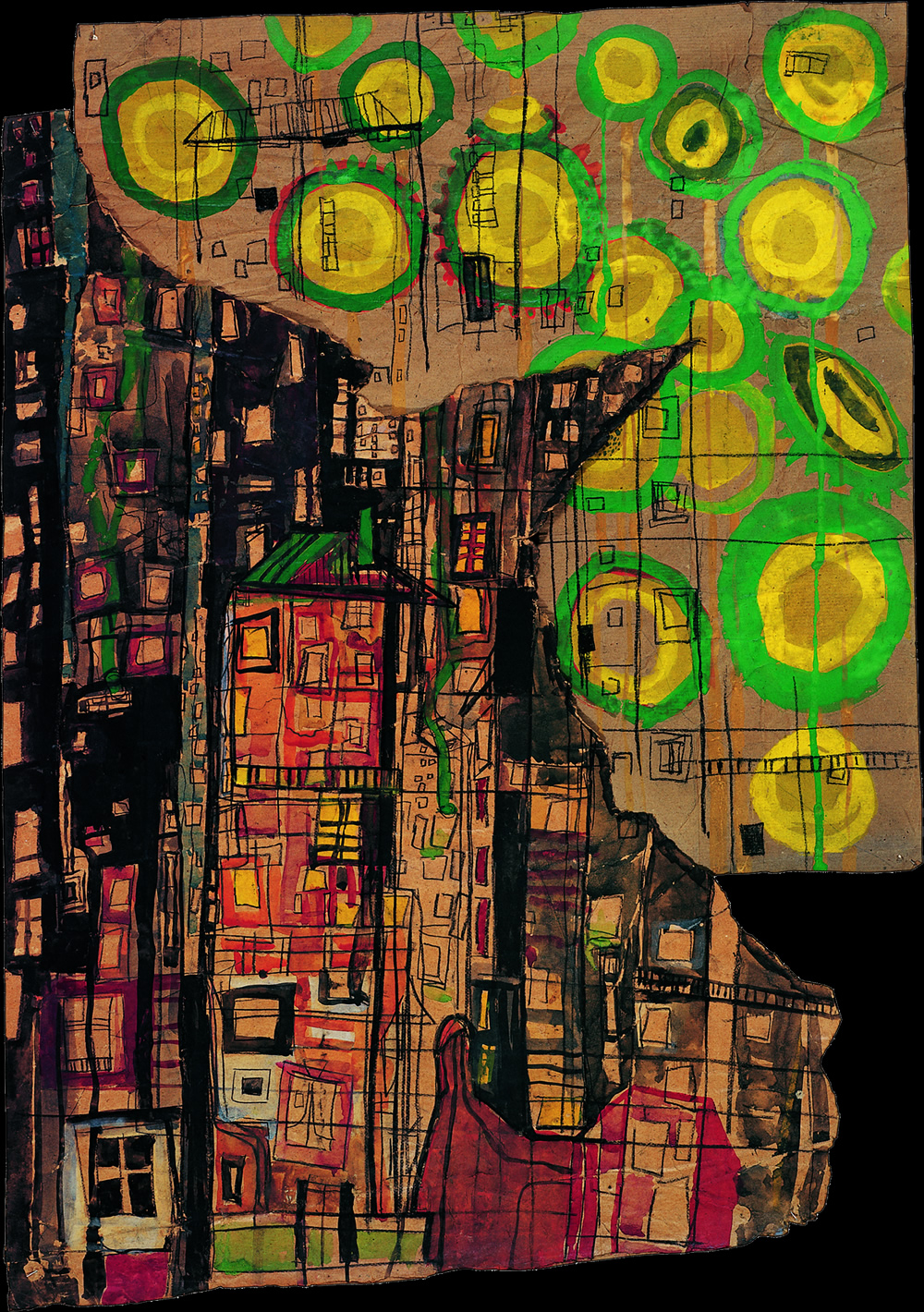
To the People of New York City (Part IX)

Staircase 1970

Daydream I 1965

Butterfly II 1968
 1970")
4 Prototypes 1970
독일 태생의 abstract painter인 Blinky Palermo(1943 ~ 1977)는 아기때 형제인 Michael과 함께 입양된 후, 1962년부터 1967년까지 Arts Academy인 Kunstakademie Düsseldorf에서 Bruno Goller, Joseph Beuys와 함께 수학합니다. 그 후 studio를 세워 작업에 몰두하게 되고, 몰디브에서 잠시 휴식 중에 마약과용으로 추정되는 33살의 짧은 삶을 마감하게 됩니다.
{via moma, hirshhorn, tate, nytimes, bbc, artatswissre, contemporaryartdaily, thedailybeast}

Aaron Siskind

Aaron Siskind

Aaron Siskind

Aaron Siskind

Aaron Siskind

Aaron Siskind

Aaron Siskind

Aaron Siskind

Aaron Siskind

Aaron Siskind

Aaron Siskind
미국 태생의 Aaron Siskind(1903 ~ 1991)는 주로 자연과 건축 구조물의 낱낱함에 중심을 둔 abstract photographer입니다
{via aaronsiskind, mocp, brucesilverstein}

Jan Tschichold

Jan Tschichold

Jan Tschichold

Jan Tschichold

Jan Tschichold

Jan Tschichold

Jan Tschichold

Jan Tschichold

Jan Tschichold
독일 태생의 Tschichold는 <Die neue Typographie; The New Typography(1928)>와 <Typographische Gestaltung; Typographic Design(1935)>의 저자로 잘 알려져 있는, 평생을 typography에 헌신한 사람으로 1972년 70세 되던 생일날 3인칭 시점에서 스스로에게 쓴 헌사는 회자되고 있습니다. “Two men stand out as the most powerful influences on 20th-century typography: Stanley Morison, who died in 1967, and Jan Tschichold.”
책으로 가득한 Leipzig에서 calligrapher로 일을 할 당시 다양한 문화예술을 접할 기회를 갖게 되는데, 러시아의 Constructivists에 감명받은 건축가 Walter Gropius가 “art and technology, a new unity”라는 슬로건 아래 Bauhaus를 건립하면서 Paul Klee나 Wassily Kandinsky같은 대가를 초빙하고, Mondrian이나 De Stijl 운동으로 Abstract art가 유입되고, “Futura” 서체를 디자인한 Paul Renner와 함께 일을 하게 되기도 하는데, El Lissitsky의 디자인에 깊은 관심을 가졌던 그에게 좋은 design이란, sans-serif 폰트, illustrations보다는 half-tone photographs(circles 또는 silhouettes), centred보다는 asymmetrical layouts, 기하학적 요소와 diagonal arrangements, two colours 이하를 사용해서 만든 디자인이라고 합니다.
하지만 German같지 않다는 이유로 Modernism에 지속적으로 의구심을 갖고 있던 Nazi로 부터 탄압을 받고, 고향을 떠나야만 했던…그러나 최근까지도 Penguin paperbacks의 굵게 가로지른 색(소설은 orange, 범죄는 green, 전기는 blue)을 기조로 한 책 디자인으로 영국에서 기억되어지고 사랑받는 Jan Tschichold.
{via tschichold, linotype, guardian}