Posts Tagged ‘aiga’
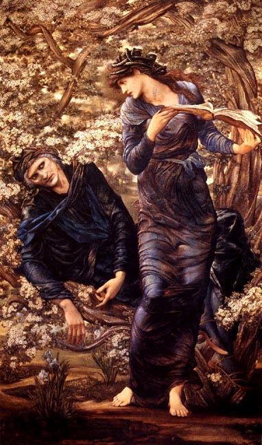
Alvin Lustig

Alvin Lustig

Alvin Lustig

Alvin Lustig

Alvin Lustig

Alvin Lustig

Alvin Lustig
1940년대 대부분의 책표지는, 단지 하나의 이미지로 책을 표현하는 방법이 주류였습니다. 심지어 사용된 이미지조차 피상적이어서 하나의 책이 다른 책들과 다르다것을 구분시킬 뿐 책과는 무관한 이미지였습니다. 이런 book cover design 풍토에 실제로 책을 읽음을 통해 작가가 말하고자 하는 바에 접근하고, 이를 자신만의 디자인 철학으로 승화시켜 혁신적으로 표현한 Alvin Lustig(1915 ~ 1955). 한창 일할 나이에 삶을 놓친 그는 미국태생의 graphic designer이자 typeface designer로 그의 작품들은 오늘날도 여전히 사랑받고 있습니다.
{via alvinlustig, aiga, scott lindberg}

“Keep it moving.”, Pablo Ferro
” 비디오에 있는 title sequence 목차:
1. Bones; 2. Men in Black II; 3. Men in Black; 4. The Truth About Charlie; 5. The Street; 6. The Latino International Film Festival; 7. Sweet Smell of Success; 8. My Big Fat Greek Wedding; 9. Hope Floats; 10. Anna Karenina; 11. L.A. Confidential; 12. Good Will Hunting; 13. All the Rage; 14. The Sunchaser; 15. Criminals at Large; 16. The Rescue; 17. Married to the Mob; 18. Meet Wally Sparks; 19. Beetle Juice; 20. Stop Making Sense; 21. Psycho; 22. For the Love of the Game; 23. Philadelphia; 24. Last Embrace; 25: American Heart; 26. Doctor Dolittle; 27. No Way Out; 28. The Thomas Crown Affair; 29. Devil in a Blue Dress; 30. Agnes Browne; 31. Heart Condition; 32. Mitsubishi (commercial); 33. Venus (commercial); 34. Burlington Mills (commercial); 35. Woman of Straw; 36. Darkman (movie trailer and montages); 37. The Night They Raided Minksy’s; 38. Zardoz; 39. A Clockwork Orange; 40. To Die For; 41. Addams Family; 42. Addams Family Values; 43. Mobsters (montage); 44. The Bronze Screen; 45. Napoleon Dynamite; 46. Career Opportunities; 47. Kripppendorf’s Tribe; 48. Dr. Strangelove; 49. That Thing You Do!; 50. As Good as It Gets; 51. Citizen’s Band; 52. Johnny Be Good; 53. Midnight Cowboy; 54. Alive (logo); 55. Beatlemania; 56. Amityville 3-D; 57. To Live and Die in L.A.; 58. Bullitt; 59. Me, Myself and I; 60. Witness Protection; 61. The Secretary”
쿠바 태생의 Pablo Ferro(1935 ~ )… 효과적인 title sequences를 만드는데 있어 typography의 중요성을 최초로 인식한 아티스트로 여러 평론가에 의해 밝혀집니다. {via AIGA}

테마에 충실한, Paula Scher

the world

Ballet Tech

The Metropolitan Opera

New York Philharmonic

The Public Theater

The Public Theater

The Public Theater
map paintings으로 유명한 Paula Scher(1948 ~ )는 미국태생의 그래픽 디자이너로 70년대 CBS Records와 Atlantic Records의 album covers를 디자인했고, 그 후 Time Inc.,Koppel & Scher, Pentagram design consultancy에서 일하고 있습니다. 아울러 Scher는 Coca-Cola, Perry Ellis, the Museum of Modern Art, Jazz at Lincoln Center, the Metropolitan Opera 등 수많은 기업 및 단체를 위한 identity 작업과 brand 홍보를 위한 그래픽 디자인을 하고 있습니다. (via stendhal gallery, pentagram, aiga)